
Above: a Ban Comic Sans bumper sticker in the Comic Sans font.
The Ban Comic Sans Web site has been around for a while. If you know the Comic Sans font, then you know how dreadful it is.
From the site:
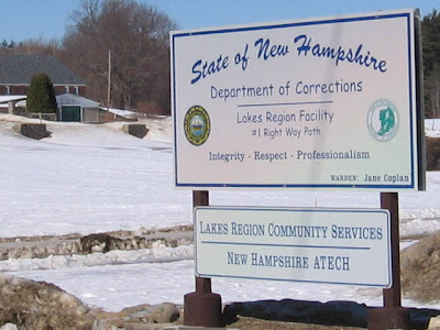
In 1995 Microsoft released the font Comic Sans originally designed for comic book style talk bubbles containing informational help text. Since that time the typeface has been used in countless contexts from restaurant signage to college exams to medical information. These widespread abuses of printed type threaten to erode the very foundations upon which centuries of typographic history are built.I do not like the font, but I do see it here and there -- especially for kids friendly signage. So, I was surprised to see it on the sign at the State of New Hampshire Department of Corrections Lakes Region Facility:
Off topic time: We saw this while attending some dog sled races in Laconia.

The starting/ending line was right across from the Comic Sans font prison sign. It was a sunny day, with temps about 32 degrees F.
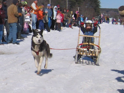
These are one-doggers.
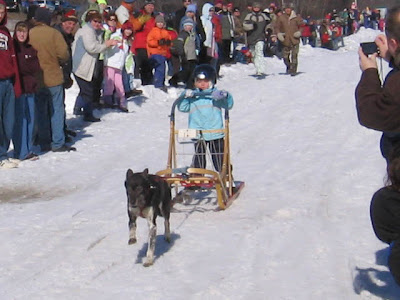
One doggers are kids with, of course, one dog pulling the little sled.
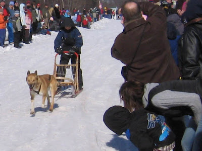
I like how these people are leaning over on the right.
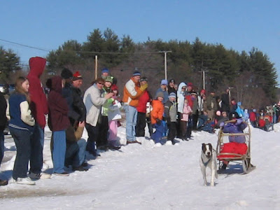
Some of the dogs did not want to stop and had to be grabbed at the finish. All the kids had serious padding and helmets.

And here's a Mom & a couple little ones, all being pulled by the family dog.
I don't have a dog or a dogsled, but it sure was fun watching this. The only dark cloud was that it was under the shadow of the poky sign with that dreadful font use!
A tip of the hat to my wife for spotting the Comic Sans sign!


6 comments:
There aren't many people in my life with whom I can passionately discuss fonts . . .
I don't really mind coming across Comic Sans in everyday life, although your juxtaposition of such a happy, breezy font with a prison is pretty funny. Two things irk me about Comic Sans: when aspiring cartoonists use it, not realizing they're marking themselves as amateurs and shooting themselves in the foot; and when professional cartoonists use it, making me wonder if the whole world's gone haywire ("Human sacrifice! Dogs and cats living together! Mass hysteria!"). For example, last time I looked, "Dick Tracy" was using Comic Sans--all caps, which is even worse. Unless they were using it ironically, which I guess is possible.
What a world, what a world.
He-he, oh the sweet smell of irony....
Oh dear. I've been shooting myself in the foot all this time (as Brian put it...)? Then again, I do consider myself as an amateur. Perhaps one of these days I'll grow up and move onto better fonts for my cartoons...
I tell ya, the best money I ever sent was getting the font of my own handwriting. LOVE that.
What software/program/whatever allows you to do that, Mark?
Thanks for the Bill Murray quote, Brian!
Post a Comment