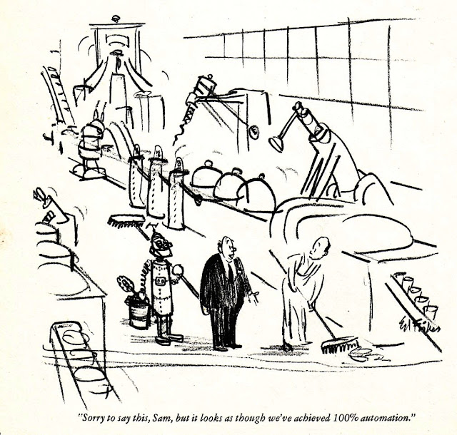
Here's an almost bare bones sketch, employing strong lines and just enough detail in that background to get a strong sense of place.
And here's a more finished ink and wash piece:
His economy of line to gives us shape and attitude in the drawing below. He knows all the right lines to leave in, and the ones to discard.
Below is a cartoon that, like some in THE DOMESDAY BOOK, looks like a rough rather than a finish. But it works very well. I am guessing this is some kind of crayon on paper.
Again, very sketchy with quickly laid out ink lines.
Adding a wash really enhances the drawing.
One of my favorites. With a fine nib and then a quick brush to give some black spotting.
Another simple drawing that looks like a rough:
Fisher's cartoons sometimes assumed you knew as much about history and mythology as he did ... and that was a lot.
Another wonderfully sketchy one:
The loose lines give so much life to a cartoon.
-- An edited version of an entry originally blogged on Wednesday, April 17, 2013


No comments:
Post a Comment