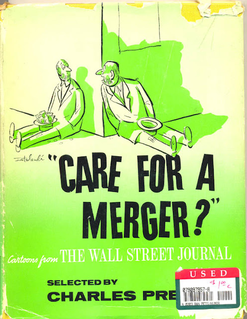
 This
1958 hardcover collection of Wall Street Journal cartoons, CARE FOR A
MERGER, was found in the used book section of a huge Barnes and Noble in
Paramus, NJ a while ago. I bought it for the Phil Interlandi drawing on the cover. Love
that guy's lines!
Copyrights retained by the copyright holder.

Above: The sad selling price history of this secondhand book, from the
inside page, unsold until it got down to $1. The original 1958 cover
price was $2.75.
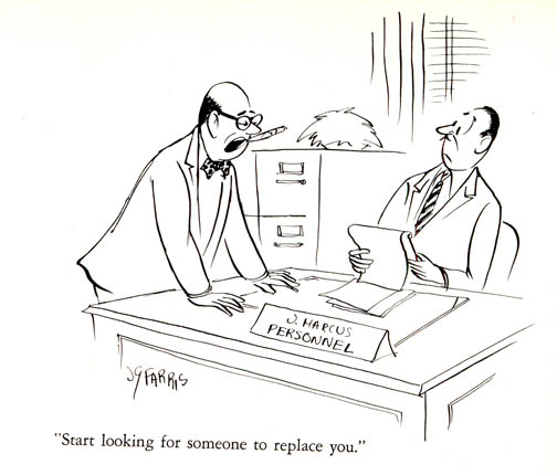 Here's
a cartoon by Joseph Farris. Love that iconic see-gar
in the boss's mouth. Whatta nasty boss! I like the juxtaposition of the
vertical and horizontal lines in the background to suggest the curtains
and blinds. Snappily done.

Lee Lorenz! And the drawing looks like it was done in scratchy pen
style. He uses a brush now -- or rather, has for many decades! This is
the only time I've seen a cartoon of his outside of the New Yorker. He
became a contract cartoonist to the NYer this same year, and was the
mag's cartoon editor from 1973-1997
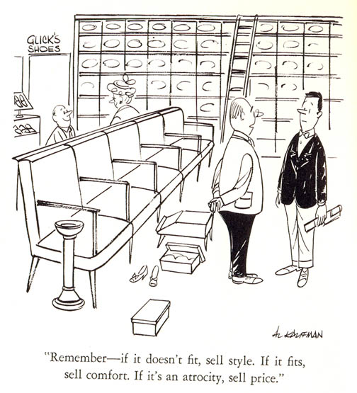
The cartoon above shows Al Kaufman's mastery of depth and layout. It
wasn't until I'd looked at this drawing, scanned it, and then looked at
it again that I noticed that the chairs were too darn big. I still like
the drawing, but I wonder why I didn't notice that right away.
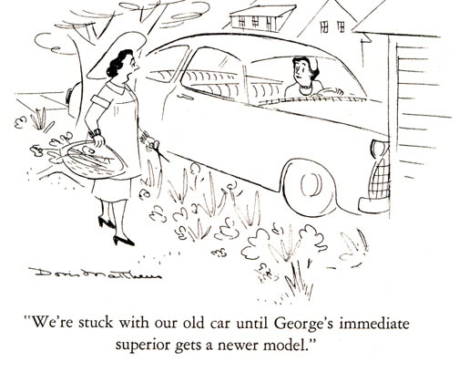
Cartoonist Doris Matthews is the only female cartoonist in this WSJ collection. You can find more of her work in Funny Ladies: The New Yorker's Greatest Women Cartoonists and Their Cartoons, edited by Liza Donnelly. I like her sketchy style, but know nothing about her.
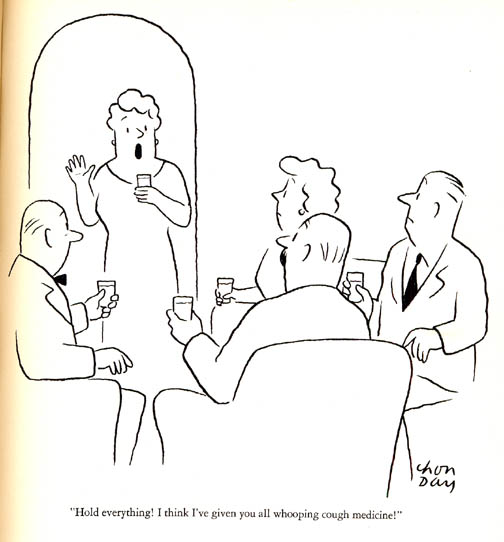
Chon Day, the master of line, has a couple of cartoons in the
collection. The lines, the placement of blacks, all done so deftly and
frugally. A prolific cartoonist who, like so many of the pros, kept
producing until the end. He created cartoons for many major mags and was
a featured regular at The Saturday Evening Post from 1948 until Mr.
Day's passing in 2000. He's another cartoonist that deserves a large
"Best of" collection.
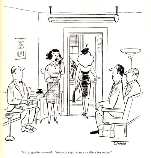
Mort Temes gives us this very inappropriate (for 2023) cartoon that tells us all that anatomy is destiny! I
do admire how Mr. Temes is able to squeeze in the boss's face in the
interior office. Of course, you notice how all the angles lead to that
office. Nicely done. Another archaic touch: the pedestal ash tray. There
was one in the shoe store cartoon above as well. You can see a photo of
Mr. Temes and other cartoonists from around this time in a previous
entry about Look Day.

Bernard Wiseman chimes in with this IRS joke. I liked it because of the
brush work. How just the suggestion of a few people and desks in the
background gives us the feel of a busy office. I like how the guy who is
speaking is leaning in to the old guy while speaking.
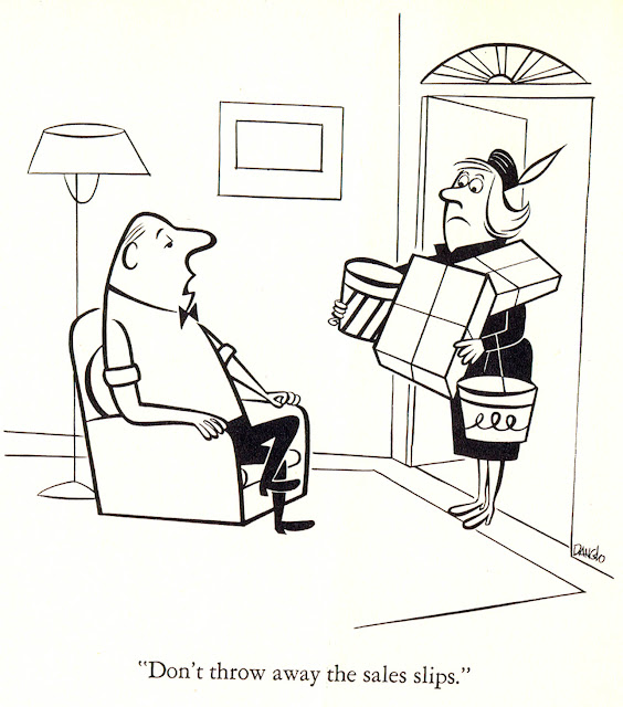
Dan Danglo,
who I am glad to say is a friend and fellow Berndt Toast Gang member,
brings us this beautifully drawn cartoon. Looks like an animation kinda
style of the 1950s, huh? Well, Dan was working in animation in the
1950s. He still cartoons today, and you can see more at his site.
-- This is an edited version of a blog entry from May 17, 2007.
Thursday, September 14, 2023
CARE FOR A MERGER? Cartoons from WSJ
Subscribe to:
Post Comments (Atom)


2 comments:
Mike,
Do you know if Preston's widow, Linda Wolf, and
Cartoon Features Syndicate are still the suppliers
of Pepper...and Salt cartoons to the WSJ?
DDDegg
Yes, so far as I know this is still the case.
Post a Comment