Wednesday, October 31, 2007

The Saturday Evening Post, February 28, 1959 UPDATED

Here we go, paging through a Saturday Evening Post from 1959. Let's explore this world of 1950s duplicity and dullness. Below: a gag cartoon by John Albano in which a cross, angry bald man has inappropriately placed another fellow's wife on his lap.

Below: A good gag, although today the big boxer would sport tattoos and piercings. You do get the immediate sense of where his is (a boxing ring, natch!) even though the cartoonist (whose name I can't make out) is only showing 2 of the 4 corners.


The great Chon Day gives us this bizarre gag. Now, did the guy just walk out of the car and happen to open the hood and walk THROUGH the grill? I like how the background (grass, bush, mountains) are drawn in 4 lines and that's all you need for a feeling of place. Economy, kids; Mr. Day has it!

Below: an advertisement against Generic brands! Buy things made by large corporations with logos and Madison Avenue ad campaigns!


Bill Harrison's cartoons shows us the lovable dope of a husband that, to this day, is the staple for much middle-brow humor. I think that this is the same fellow who, in the same year as this issue of The Post, began Harrison Greetings.


Veteran gag cartoonist Edwin Lepper gives us one of those "the moment before chaos" cartoons. I like cartoons where you imagine what will happen in the next couple of seconds later. It may have been more fun to draw a couple of brawling brides, but the choice of this nanosecond before their mutual discovery was, I think, the funniest choice. The non-reaction from the groom is a nice touch.


Below: Some great wash effects. Cartoonist Kirk Stiles' wash efforts reminded me a bit of Jack Cole's brush work, and that's the best praise I got. The gag, though, is a bit silly.


A color ad below: This looks kinda like an anime version of a bee. It reminded me of the character design in the BEE movie that's opening this week which, like this 48 year old bee below, is similar and not pretty.


Below: Bob Schwartz Schroeter gives us "blogging" 1959-style. I like how the regular guys are all in shirt sleeves and "management" sports grey blazers. A subtle way of reinforcing the power structure that you need to perceive understand in this gag.


Stiles and Lepper and Schroeter are three cartoonists who have scant Web presence. I was not able to hyperlink any bio info.

Below: One of the most boring stories I have ever read, and I have to wonder why it saw the light of print. Dull, dull, dull. I said there was dull, and here it is. The only silver lining: It's a good excuse for nice illustration by Boris Drucker; a piece of art that conveys more action and mayhem than the actual story of these two farmers ever had ever, ever in a million, jillion eons.

I said there would be duplicity today (other than the gag with the 2 brides). Below: Echoes of that earlier cartoon by Chon Day! This is a good gag by Joe Zeis, but the fact that Day's similar gag precedes it cheapens the effect.


This being the Saturday Evening Post, the last cartoon you get on the inside back page is HAZEL by Ted Key. Looks like HAZEL has lost her license (probably a DUI conviction) and now must bank via one of the kids' bikes.


Orlando Busino, cartoonist extraordinaire, just wrote an email and makes these corrections to my errors:

The boxer gag on your blog whose signature was hard to read was done by Jeff Monahan and the cartoon attributed to "Schwartz" is really Bob Schroeter's work. Bob was cartoon editor for the King Feature's Laff-a-day panel for quite awhile. Both cartoonist have passed away.

I thank him for graciously correcting my errors! Thank you, Orlando! And happy belated birthday, sir!

Tuesday, October 30, 2007

Dangerous Graphics


Just bought a Sears Craftsman snowblower with the above warning sticker on it.

I can only imagine the dialogue across the Sears conference table:

"We have to show how dangerous machine can be. Should we show a limb in the process of being severed? What about blood?"

No blood in the final version, but I bet, over coffee and a nice spread, those corporate intellects vast and cool and unsympathetic regarded the visual depiction of the moment of limb mutilation in a series of serious, humorless meetings.

Heck, maybe there was a motion (made by a junior exec., I bet) to require a certain proficiency of customer IQ test results before allowing someone to buy a snowblower. But, well, this is America, and stupid people got money and Sears needs money, gang!


It's the jagged edge on the wrist that simultaneously horrified and startled me.

Monday, October 29, 2007

Cartoon Look Day: Memos from Gurney Williams


Via Eli Stein comes more cartoons by 1950s gag cartoonists for 1950s gag cartoonists drawn for the insider cartoon industry "Memos from Gurney Williams" newsletter. Go and click and see!

Above: Mrs. Virgil Partch imparts that month's cartoony mission statement to Mr. Virgil Partch.

Related threads from Eli's blog and this one:

How Not to Get an Okay part one

How Not to Get an Okay part two

Cartoon Look Day

Paul Giambarba

Photo: Mike Lynch, Paul Giambarba

Had the pleasure of a (all too short) visit from illustrator, caricaturist, designer, cartoonist and bon vivant Paul Giambarba, who was vacationing in the White Mountains, near where we live. He graciously got in his car and battled touristy traffic to get out of the Ossippee area just to chat with me.

Paul's a guy who's done the Wednesday Cartoon Rounds (more about that tradition in general here), worked as a designer (he created the well-known Polaroid look as detailed here), drawn childrens books, is a wonderful photographer and has more talent than allowed by law.

I love Paul's use of color, particularly his watercolors. He uses such a warm, natural palate. Anyway, we chatted, as I said, for too short a time and I appreciate his inviting me to his Massachusetts studio for some more shop talk and bay scallops ala Giambarba some time in the near future!

If you want to read more, check out my pal Rod McKie's interview with Paul here.


Above: a page from Paul's sketchbook from a 1955 trip to Europe.

Saturday, October 27, 2007

STAR TREK II The Wrath of Khan/MONTY PYTHON

It's the death of Spock ala The Holy Grail! This runs about a minute.

Friday, October 26, 2007

Via Mark Anderson: OSU Cartoon Fest Live Blogging UPDATED

The OSU Cartoon Festival is Friday and Saturday, and what' s the next best thing to being there? Mark Anderson live blogs!

Day One

Day One Pics

Day Two

Graphic Novels: Threat or Menace?

From Tom Tomorrow's blog on The Huffington Post comes "Graphic Novels: Threat or Menace?"

He sums up what's happened with the teacher in Guilford, CT who gave a comic book (Eightball #22 by Dan Clowes, a respected graphic novelist whose latest work is being serialized in the NY Times) to a kid and was forced to resigned.

Pictures. Little drawings on a page. People are afraid of 'em! This is why I'm in a high risk profession.

H/t to Journalista!

Cartoon Batch Mailing

"What do you mean when you say you send in a 'batch?'" - syndicated cartoonist to me.

A "batch" of cartoons is the industry slang, among those in the gag cartoon industry, for a packet of cartoons. My batches can vary between 10-20 cartoons per mailing. I talked about this in my Selling Cartoons to Magazines entry last month.

I want to talk about the SASE, the Self Addressed Stamped Envelope, and what to do when there's no response from an editor.

SASEs:

I put a code in the corner of the envelope ("GH 10/1/07," for instance, letting me know that the SASE envelope (when/if I get it back) is from Good Housekeeping and I mailed it on October 1, 2007). This helps if there is no note inside from the editor.

There are no rules about SASEs.

No response from editor:

In the past year, it seems that about half of the markets are bad about returning batches. I have a SASE, and cartoonist Mark Anderson has a preprinted postcard with postage for the editor to return. He wrote about it on his blog, if you want to go Googling. We both get the same crummy 50% response rate.

I don't think that the editors are trying to send a message, I think that a lot of editors do a lot of tasks during the day. Cartoons are not as big a priority as some, and they can get back burnered and become forgotten.

I wait 30 days, and if there's been no response, I'll print off a dupe of that batch and mail the same batch to another, similar market. I do go on and keep sending for a couple months even if a market has not returned my SASEs or responded in any way. If I have a market that goes a couple months of me sending and no response, I'll call to ask (in a friendly way) have they seen my cartoons and can we have a short talk about their cartoon needs. Sometimes I get a nice person, sometimes I get someone who really doesn't have the time. A lot of times, I talk to a voicemail.

I've had long discussions with cartoonists about sending out the same batch (called "simultaneous submissions") after 30 days to another market, and some disagree with me. My take: 4 weeks is long enough for a professional editor to open my stuff at that first mag I sent to and respond. It's only by continuously moving your product that you can see sales.

Thursday, October 25, 2007

Seminal Bill Watterson Art


A gallery of Bill Watterson's college work and early Calvin & Hobbes promo drawings are at Tim Hulsizer's Rare Bill Watterson Art page. I'd seen his work for Target magazine, but most of the promotional pieces and the art for Kenyon College, where he went to college, is new to me.

H/t to Journalista!

Wednesday, October 24, 2007

Creig Flessel to Receive "Sparky" Award


From Editor & Publisher: Creig Flessel will be awarded the "Sparky" award (named after Charles Schulz) on Sunday.

Mort Gerberg Interview at Publishers Weekly


Above: a Gerberg Sandwich; Mell Lazarus, Mort Gerberg, and editorial cartoonist & GRIMMY creator Mike Peters from a photo I took at the 2007 Reubens Convention.

Upon the occasion of the Mort Gerberg-edited cartoon collection LAST LAUGHS: CARTOONS ABOUT AGING, RETIREMENT ... AND BEYOND, comes a Publisher's Weekly interview with Mort written by none other than Calvin Reid.

Here's a quote from Mort about his career:

Finally, in the late 1960s I got a chance to start with the New Yorker, but it took a long time. You had to pay your dues to get in there. Bob Weber, one of the great New Yorker cartoonists, submitted cartoons for a year before he got in—and he didn’t even get a rejection note back during that time.
Link to AP story "Cartoonists Take Aim at Aging, Dying" by Malcolm Ritter.

The good thing about this book is that there will be cartoons in it that no one has seen before; i.e., it's not entirely a book of New Yorker leftovers.

My favorite "death cartoon" is this one by the great Lee Lorenz.

H/t to Tom Spurgeon over at the Comics Reporter.

Tuesday, October 23, 2007

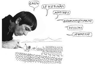
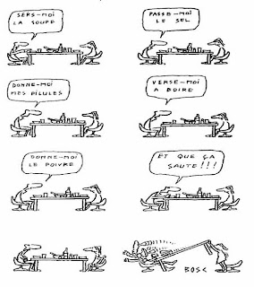
Cartoonist J.M. Bosc Site


French Cartoonist J.M. Bosc (1924-1973) has a wonderful site (click here for Google translated version) that was lovingly put together by Bosc's nephew, Alain Damman.

Bosc is, for us US readers, one of those names that would appear in those big "Best Cartoons" collections that Lawrence Lariar would edit every year. Sadly, those days are gone -- but if every cartoonist had a nephew like Alain, then we would be able to see so many of these cartoon through the years!

My thanks to Alain for alerting me to this extensive site -- a trove of cartoons and information. Thanks, Alain!

Accident

Personal note to the friends and colleagues who read this blog: I had a car accident yesterday. I'm OK. No one else was hurt.

My car may be totalled. Heckuva way to start out the week, but it means no blog for a time.

Sunday, October 21, 2007

Doggy as "Shrek"


Saw the above while in a department store. Look, cartoonist William Steig wrote SHREK. SHREK is now a hit series of movies. Do not do this to your dog in the name of William Steig, OK? OK!

Saturday, October 20, 2007

STAR TREK Fotonovels

There used to be these books, called Fotonovels, that were basically "screen captures on a page," with dialogue balloons. Of course, nowadays, you just pop in a DVD or buy an episode over at iTunes and you get to see whatever you want. But in those dark 1970s, you only saw the TV that the TV programmers wanted you to see. One of the few ways to linger over a fave TREK episode was to buy a TREK Fotonovel.

Bully, over at his Bully Says Comics Oughta Be Fun blog, showcases these TREK Fotonovels and shows many examples. All in all, they are creatures of their time. And they were the only way to re-experience a favorite episode.

And stick around Bully's blog. If you like comic books or TREK or Wodehouse, it's a nice place to visit. Take it away, Bully ....

Friday, October 19, 2007

Stan Lee in THE ATLANTIC


Just to show how mainstreamy comic books are as of 2007, Stan Lee contributes to the 150th anniversary issue of THE ATLANTIC:

Joyce Carol Oates, Cornel West, Bernard Lewis, David Foster Wallace, and others reflect on the future of the American idea; Robert D. Kaplan pictures America’s elegant decline; and more…

Mr. Lee gets his name on the cover, along side some serious literary names.

"America is a Dream," with art by Anthony Winn, is spread across a gatefold of this month's mag. You can read the first couple of panels at that first link above. You can see the whole thing online if you're an ATLANTIC subscriber.

Thursday, October 18, 2007

The Executive Coloring Book (1961)

From Johnny C.'s A-Hole-in-the-Head blog, comes a parody titled THE EXECUTIVE COLORING BOOK circa 1961.

Part one

Part two

A great find, Johnny! Thanks for sharing!

Wednesday, October 17, 2007

AMERICAN MASTERS Good Ol' Charles Schulz

A 3 minute promo for Monday's 90 minute AMERICAN MASTERS episode chronicling the life of Charles Schulz.

More Schulz from the Charlie Rose show here. It starts about 20 minutes in (after Bill Richardson). He talks about the death of his mother, using the names of friends in PEANUTS, cartoonists "not worthy of being in art galleries," the process of doing a comic strip, and so on. I'm guessing that the date on this is about 1994.

MAD's Greatest Artists: The Completely MAD Don Martin


Above: a set of stamps from the Fall 1975 Mad Special (which I bought in downtown Lawrence, KS back in the day) by the late, great Don Martin, reprinted in THE COMPLETELY MAD DON MARTIN. Is his family compensated for this?

To have a collection of all of the cartoon work that Don Martin ever did for MAD Magazine would be wonderful, right? All of us fans would shout, "Thank you, God!" just like the Lucky Boy character in Animal House when blonde Babs Jansen hurtles thru his window, landing on his bed. This is an unexpected fulfillment of a want we got!

And it's here, in a fancy schmancy 2 volume, slip cased edition on better paper than Gaines ever thought of buying, with photos and extras from MAD's Usual Gang of Idiots. THE COMPLETELY MAD DON MARTIN set, which retails for $150 (but can be bought for under $100 from discount places), has all of Martin's cartoon work from 1957 to 1987. Yeah, another grand hardcover set, like the now precedent setting slipcased FAR SIDE, and the CALVIN & HOBBES collections. The place that put the book together is the same place that did the C&H collection.

Martin left MAD in the 1980s over a dispute about money and rights. Mr. Martin has since passed away. Twenty years later, I wonder: is Time Warner cutting a check to the man's family?

If I'm buying it, without the cartoonist's family getting a serious cut, I am making a statement with my purchase that this is all just peachy keen.

If all of the dough is going into Running Press' pockets and Time Warner's, then I would rather not help. This isn't an indictment on the idea of the book. It's a grand idea for a book! And it was wonderful to read at Craig Yoe's Arflovers blog, in his interview with Running Press publisher Jon Anderson, that it's sold out, with no chance of a reprint pre-Holiday season.

But I haven't read anything to assure me that the creator's heirs are seeing money.

As I wrote earlier this year, PLAYBOY and NATIONAL LAMPOON are putting out complete DVD editions of their mags without compensating the people who actually created the content. If that's the future of content providers like me, then I won't support that. Nope. No sir. No, thank you -- God, or Time Warner. No thank you!

Mayerson on Animation: Marjane Satrapi at the New York Film Festival

From the Mayerson on Animation blog comes video of Marjane Satrapi at the New York Film Festival.

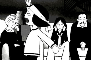
She co-directed the movie version of her graphic novels PERSEPOLIS and PERSEPOLIS 2, which are coming of age stories of her life, growing up in Iran. As Mark Mayerson suggests, it's worth watching that first clip for insight into her story and why she chose to an animated story instead live action.

PERSEPOLIS is a very good graphic novel and the movie version is scheduled to be released in the US this fall. It is France's Academy Awards entry.

Sony Pictures PERSEPOLIS movie site.

Tuesday, October 16, 2007

Review: SISTER MARY DRACULA by Gerry Mooney


SISTER MARY DRACULA by Gerry Mooney, 28 pp comic book; color cover, B&W interior; contains comic strip GOO AND ROO. US$3.00

Gerry Mooney has written and drawn the beginning of a graphic novel in his SISTER MARY DRACULA comic. It says "Chapter 1" right there on the cover. Gerry sets the stage for the adventures of a couple of young kids at a Catholic school (protagonist Terry Malloy, his pals Stevie and Kenny) where Sister Mary Immacula may or may not be a vampire.

Terry likes to draw. No, scratch that. Our main character Terry loves loves loves to draw. He won't go out and play with Stevie and Kenny until he finishes his drawing.


Above: page 2 of SISTER MARY DRACULA

Gerry keeps the story trained on Terry as he, in the next scene, worries to his friends about a scary encounter with SMD. But, when Stevie changes the subject, asking Terry how his drawing turned out, Terry immediately shifts into a state of excitement. It turned out great! I thought this was funny and believable. Kids can shift moods quickly.

I enjoyed the fantasy sequence (with a conscious or unconscious nod to Spaceman Spiff) when Terry rode his bike. When you first get your bike, and your parents allow you to ride it -- then your whole world gets bigger. The bike ride is a metaphor for expansion here, but the book (and this is my only serious criticism) is stifled by its length. Those 20 pages went by like a swift ride downhill on a kick ass Schwinn with trick tires and a banana seat. I wanted more.

There isn't nearly enough of the title character, but she does get talked about by the boys. She is, at least to Terry, the boogy man.

I liked the book and would like to see more. I though that the world that Gerry showed -- being a kid, playing outside with your friends, life in the 'burbs -- all rang true. The only thing is that it's a portion of a larger work, and it left me with a serious bit of the want for more story. Or, as Ulysses Everett McGill puts in OH BROTHER WHERE ART THOU, "One third of a gopher would only arouse my appetite without bedding it down." This quote only makes sense if you change out "one third of a gopher" for "part of a graphic novel."

Creator Gerry Mooney is the opposite of opaque. At his site, he'll show you the Flash animation that he did of SMD (which premiered at the San Diego Comicon in 2004), as well as tell you how he draws the comic.

I look forward to SMD #2.

UPDATE: The Flash animation of SISTER MARY DRACULA was completed in 2001 and shown at the San Diego Comicon in 2004 (not at the 2001 Con as I originally wrote). I've corrected the review above.

The comic book has 24 interior pages. I traditionally count the front and back covers, as well as interiors, since in many cases there is content there. That's why I note that it is 24 pages in length.

My thanks to Gerry for these corrections/clarifications.

Get Well Soon, Marie Severin

Marvel Comics artist and colorist Marie Severin is in the hospital. Dirk Deppey, reporting for Journalista! has the details which I'll cut & paste here:

Above the Fold

  • [Top Story] Eric Reynolds reports that legendary comic-book artist/colorist Marie Severin has been hospitalized after suffering a stroke last Thursday. Few details are available at the moment, but get-well cards can be sent to:

    Marie Severin, patient
    c/o Huntington Hospital
    270 Park Avenue
    Huntington, NY 11743

Monday, October 15, 2007

Stop or I'll Scream!

There is nothing half so much worth doing as simply messing about with gag cartoons, to heavily paraphrase Ratty from The Wind in the Willows.


STOP OR I'LL SCREAM, a collection of cartoons from Collier's edited by its cartoon editor, Gurney Williams, was published by Robert M. McBride & Company in 1945. "An Album of more than 300 funny drawings by nearly fifty of Collier's cartoonists," says the interior frontispiece. Regardless of me bandying about $5 words like "frontispiece," here is, for your blog reading pleasure, but a wee fraction of the interior.


George Lichty's style always looked like his ink line was just slightly out of control. His eccentric characters would later get daily exposure with his Grin & Bear It syndicated daily panel.

Bo Brown's cartoon reminds me that not that much has changed with bus interiors in 62 years. We still got the straps, the poles, and the rude drivers.


Sam Cobean contributes a wordless adventure. Like I mentioned yesterday, he would have been better remembered to today had he not passed away too early in a car crash.

Another Cobean. Lovely touch: the dropped hat & cane.

Virgil Partch or "VIP." Another cartoonist killed in a car wreck! At least VIP had a couple more decades' of work out there and he's still well remembered today. Just go and Google the guy! A great, unique gag. Someone should do a hardcover collection of his work one day.


Reamer Keller contributes a pre-sexual harassment era gag that would garner rejection after rejection these days.

By the end of the war, a lot of the ladies were involved in running industry -- but then again, if you didn't all ready know that, then you picked it up painlessly from the cartoon, didn't you!?


Dead pan, spot on Chon Day shows us the power of simple lines and a bit of wash.

Sunday, October 14, 2007

Woman's Day March 1951


This little kitty (who reminded me of our new kitty, Trout), a 3 month old cat that belonged to the photographer, graces the cover of the May 1951 WOMAN'S DAY magazine. I picked this up in an antiques shop in SW New Hampshire. Mags back in the day used more cartoons and illustrations than ever, and let's just shine a spotlight on a few:


New Yorker cartoonist Sam Cobean puts meat on his table by schilling for Ken-L-Ration dog food, made with "100% real meat!*" Sam Cobean puts lovely energy into his cartoons. It was a tragedy when he died in a car wreck in Watkins Glen, NY at the early age of 38.

Take a look at his site. It's one of the best.

"*U.S. Government Inspected Horse Meat."


Above, an ad that was probably put together by the Johnstone & Cushing company, a firm that specialized in comic strip ads. In this installment, our title character get a buzz from Lipton that allows her to deal with the "Terrible Twins," Pete & Pat. Better living thru chemistry!

Actually, looks like Petey and Pat met up with some chick in the background of panel 5, and, off camera, she force fed the little terrors a couple mega doses of Ritalin.


In the middle of an article you get, as a lovely page break, a poem, with a hippo drawn by Richard Scarry.


This short story, "I Married a Folding Woman" by George Alna Brastow, complains of his wife's obsession with folding things and putting them away. Yeah, that's our man's biiiig problem: his woman folds stuff. The Eisenhower years! Ack!

Tom Funk's illustration is nicely done. The folded page isn't really folded -- it's all an illusion and an intentional part of Mr. Funk's illustration.


Above: THEY'LL DO IT EVERY TIME ala 40% Bran Flakes! Al Scaduto continues the panel for King Features. Al started with King right outta high school in 1946!


Clear sunny, yellow margarine is the key to good food energy ... unless you live in one of those states where it's banned.

Some energetic figure work by an uncredited commercial artist.


When you are really want to impress those snobby ol' Thurston Howell types, serve soda crackers. Yeah, right!

We all know that if you want to impress those classy rich people, serve Ritz! It's named after that ritzy hotel, after all!

Click above to super-size, and ask yourself the same question I did upon reading the bottom line of this ad: Why oh why does Richmond, VA hate the Keebler elves?


This is all messed up. Give a dog a piece of dog candy and then he will stop being a dunce? Weird. Dogs are kinda dopey to begin with. Sweet, but dopey. Candy will just get a dog hepped up on sugar and he'll wee all over the lawn. Oh, and then there's the doggy dentist bills!

And what is the graph that's in the corner? Oh, I guess it's Charge Healthful Dog Candy's market sales.


Corporate America once again using the youth of this country to schill its products.


Above: I had to look at this for a minute before I figured out that the ghost is carrying out an old timey outhouse.

Above: ordinary housewives (you can tell because they're all in glorious B&W) agree that Fleischmann's Yeast is "Wonderful." Today, this ad would've been handed off to a celebrity like Paris Hilton whose reference to yeast is, well, entirely different.

That's it. I'll say no more.