Friday, August 29, 2008

Shaenon Garrity on Cartoonist Anne Cleveland

Shaenon Garrity writes about fellow Vassar alum Anne Cleveland and her legacy at Vassar.

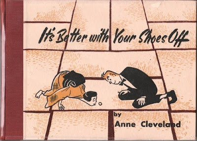
Ms Cleveland is a cartoonist whose work IT'S BETTER WITH YOUR SHOES OFF was featured here at this blog in November.

Shaenon provides more information on a cartoonist whose work we'd like to see more of. Her article is heavy on photos, like the one on the left with her at the Alumnae House pub, which "is entirely decorated with murals and paintings of college life by Anne Cleveland."

A big tip of the hat to Brian Moore for this!


Some scans from the Mike Lynch Cartoons blog of Anne Cleveland's book IT'S BETTER WITH YOUR SHOES OFF:

IT'S BETTER WITH YOUR SHOES OFF Part One

IT'S BETTER WITH YOUR SHOES OFF Part Two

Some Music Cartoons

Here is an example of some niche market cartoons. Most of these have proved to be popular reprints.


I think this joke/pun is good and the cartoon was turned down everywhere when I first submitted it. BBC Music Magazine (a classical music magazine) finally saw it and bought it on the spot. It's been reprinted a couple of times in other places.


The above risque cartoon never got bought by the good folks at BBC Music Mag. A matter of fact, I don't think anyone bought it, but I always liked it. No reason concert goers can't have a moment of raw, animal emotion!

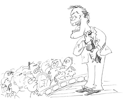
OK, it's that moody Beethoven guy getting the ladies to feel sorry for him. The sad thing is the ladies can tell him they can feel his pain, but he cannot hear them. An unsold cartoon. Perhaps there are too many people out there that can't take the big B off his pedestal!


Wall Street Journal ran the above odd one and I think it was in an overseas mag as well. Look at all those small pen strokes I was using at that time.

(My Vista program is interfering with my cartoon file log and I cannot open it, otherwise I would be able to talk more specifically about where these cartoons appeared, darn it.)


Above: I thought this was a dopey joke about a famous Schubert piece. But, to my surprise, it got printed and reprinted. I guess the guy has a point.


Above: a perennial that's been used a number of times. Most recently is was used in a scholarly paper in The International Journal of Interdisciplinary Sciences.

Yes, really!

I like the blank look on the dog's face.


Above: an early, inky, wordless cartoon showing our then sweet kitty Opie walking on the keys. This was bought by Reader's Digest but I've never seen it in print.


Above: The Macaroni Trio. This odd cartoon got a couple of buys. Sometimes it helps to imagine inanimate objects behaving like people; toasters playing baseball, dancing cigarette packages, etc.


Above: this is a true music factoid. Did you know that bass players have to pay for an airplane seat for their mega-size cellos??? True!! The above cartoon has seen print many times in music publications.


Above: the Chronicle of Higher Education ran the octopus cartoon, which was subsequently reprinted in a couple of other places. This is from years ago. I remember doodling the octopus with all the instruments and then his agent, forcing him to perform. And then the logical, scientific part of me remembered that octopi need to be in sea water, so the octopus would, of course, be dying if he was in, for instance, a theatrical talent scout's office.

SNAFU: the writing on the door should be backward.

The Way I Started my Day

I was reading Mad Magazine #493 this morning and laughing out loud at Sergio Aragonés' cartoons.

Nice to know some things never change.

Thursday, August 28, 2008

Web Cartoonist Business Model


An August 18, 2008 Publisher's Weekly's article on Templar, Arizona Web cartoonist "Spike" (Charlie Trotman) focuses on the long-form story in the strip as well as her ("Spike" is a woman) business model.

Here's a portion of this informative article by PW writer Brigid Alverson:

"The income stream for Templar has three elements. The first part is ad sales on the site, through three different networks. 'Depending on which one I’m talking about and how good a day it is, I can make 76 bucks from one of those ad networks or I can make 40 cents,' Trotman says. 'It runs the gamut.'

"... The second element is direct donations. 'I found the best thing to do with the tip jar is to offer bonus pages—if you give $100, I will update four times this week,' she says.

"The print edition accounts for the lion’s share of her income, however. Trotman starts by taking pre-orders, so the book is already in the black by the time it goes to print."

Read the entire PW article here.

Helpful link: New to Templar, AZ?

Above graphic from An Interview with Spike by Xavier Xerxes.

Hat tip to Journalista!

QUINCY by Ted Shearer


Ted Shearer's comic strip QUINCY ran from 1970 until he retired the strip, 16 years later. Ted was a cartoonist with a wonderfully grounded knowledge of illustration. QUINCY deserves more than a quick look, it deserves to be remembered.

The cartoons reproduced here are from the softcover collection QUINCY, copyright 1970, 1971 and 1972 by King Features.


Quincy was, in the tradition of the 1930s strip SKIPPY, a scrappin' philosopher. It was kid-friendly, and a beautiful thing to look at.


Jamaican-bone Ted Shearer (1921-1996) grew up in Harlem. He sold his first cartoon at the age of 16 to the New York Amsterdam News. He studied at Pratt, in Brooklyn, NY. He served in the army in WWII, in the 92nd Division, achieving the rank of Sergeant. He was a regular Stars & Stripes contributor.


Since 1937, Ted had been drawing features for the Black newspaper press. Some samples here, from Ted Jackson's great Pioneering Cartoonists of Color site. After the war, you could see Mr. Shearer's cartoons in leading magazines. He began working full-time for the the prestigious BBD&O advertising firm in the 1950s, becoming an art director there.


But he left his career for QUINCY. One of a group of new, post-war kid strips (along with WEE PALS, TIGER and MISS PEACH, to name a few), but the difference here was the look and the tone of the feature.


One source says that he achieved those painterly swooshes of dots by using some kind of Benday (or "Ben Day") paper; a specially treated art paper, popular among editorial cartoonists, that you could brush a clear fluid onto it and then dots or lines (depending on the kind of paper & the kind of fluid) would appear. It's still available, but I have been told that it's (a) expensive and (b) all those chemicals are not good for you.


Above: this is what I like about the strip. Here's a conversation that has nothing to do with running down a Harlem street and shooting some hoops; but it does no harm to show that. It's also just like kids: they talk and talk, throughout the day, no matter what they're doing. I like the kids' point of view; a low angle -- in the first panel. That bit of fence on the right, in the second panel, is just enough to let us know that they're on a playground in the city. The swooping grey Benday clouds give us the sense that this is a gloomy and/or dirty place.


The reason I wanted to show these strips is because of Ted Shearer's mastery of place and composition. By looking at the above 4 panels, we can see 4 different views that show us who these characters are and where they live. The third panel, with the city angling over Quincy and his friend Sneeze, is gorgeous.


The juxtaposition of light and dark, and the different shapes -- the jagged lines of the grass, the rectangles of the strips, the jagged stones of the fence -- all combine to give a personal, even a painterly, depiction of the park.


Mr. Shearer enjoyed painting and was in many gallery shows. He also created the BILLY JO JIVE series of books with his son.

The drawing of Quincy, Viola and Sneeze, walking away in the final panel, is an example of good cartooning. Here we are, looking at the backs of 3 cartoon characters, and we can see they are alive; each walking in a different angle, their bodies at slight pitches. And that lone hydrant next to them -- it's Ted Shearer reminding us these are city kids.

Wednesday, August 27, 2008

Mike Lynch Speaks


Here's the press release:

Cartoonist and prominent cartoon blogger Mike Lynch will give a talk at the Guy Gilchrist's Cartoonist's Academy on Saturday from 12noon until 3pm on Saturday, September 13th, 2008. Prices are from $25 to $15.

Mike will be talking about cartoons; the craft and the business of cartooning. He will emphasis some of the hands-on issues a cartoonist faces: how to be consistently creative, self-promotion, dealing with clients, negotiating contracts, invoicing, finding markets, and other topics.

The Cartoonist's Academy is in Simsbury, CT, which is near Hartford. Reservations can be made in advance by calling the Academy at (860) 651-4400. If you need directions, don't hesitate to ask.

... And, just in case, I may have to use this site to accentuate any humorous stories.


KING KOJO with Illustrations by Marge Part 2

Some more rarely seen illustrations by LITTLE LULU's creator, Marge.

Here are another handful of scans from the out-of-print children's book KING KOJO.

Part one is here.


KING KOJO was written by Ruth Plumly Thompson, best known for continuing to write yearly installments of Frank Baum's OZ books after his death, with illustrations by Marge (Marjorie Henderson Buell), who created LITTLE LULU. The book is copyright 1938 by the David McKay Company.


KING KOJO is a nice guy; a good king, but a little bumbling ala McLean Stevenson's Colonel Blake in the TV series M*A*S*H.


In some but not all of the drawings, there's a little "M" somewhere at the bottom to let you know it was Marge Buell who drew these. Marge is the only cartoonist I know who can show you any expression without drawing a mouth. Case in point: the expression of the mouthless horseman above.


It wasn't until the third time I looked at the above illustration that I noticed that everyone's hand is a series of unclosed lines.


Some nice mastery of line to add value to the drawing. Our man in the lower right ("Pogo," the jester) has no mouth yet he looks pouty. A technique she used a lot with Lulu and Tubby.


OK, here's what I mean: here's a fellow who is obviously displeased to see his own mug on a "Wanted" poster. Who wouldn't be? And, as you already noticed, he has no mouth; just that pout-- and that's all we need to telegraph that he is pretty darned cheesed off!


Marge was a friend and a fan of author Ruth Plumly Thompson's since she was nine years old, according to the OzClub page on Thompson.

Marge was 34 years old when this book was published. These series of KOJO stories were first serialized in King Comics, which David McKay edited.

Here's a bit from her bio at the Harvard Web site:

While drawing "Little Lulu," Marge continued to draw other cartoons. In 1936, Ruth Plumly Thompson became the editor of King Features, which published monthly magazines of humorous stories and comic illustrations and strips; Marge often illustrated Thompson's stories published therein. A serial entitled "King Kojo," written by Thompson and illustrated by Marge, was first published in King Comics, then published as a book by David McKay in 1938. Thompson regularly wrote a humorous verse entitled "Sis Sez" for the back page of King Comics; Marge illustrated these as well. By 1943, however, Little Lulu's expanding horizons meant that Marge could focus only on her.


Lovely bit of shock on the guard's face here -- and notice how everything is drawn in a hurry. Even his buttons are drawn quickly, almost sloppily. I'm reminded of what veteran gag cartoonist Lo Linkert said about style:

"Work fast because speed gives you a distinct style. Slow lines look stiff."

Aside: I wrote more about Lo Linkert (1923-2002) during a guest blogging-stint at the Andertoons blog here.


I like how the King's whole body goes into a shocked take -- bent knees, hands frozen, body shaking.

Just look at those swishy action lines around the explaining hands. Deftly done.


Above: if you click on the image above, from the endpapers of the book, you get a nice Chip Kidd super close up effect. You can see the of drawing Kojo, the word DISCARDED at his feet, and a handwritten note above: "Edges mutilated." Yes, this was one well-loved volume.

Tuesday, August 26, 2008

Video: Interview with MISADVENTURES OF A ROVING CARTOONIST Co-author Tim Lasiuta

Here's a short local TV interview with Tim Lasiuta, who edited and co-authored my friend (and long-time Lone Ranger comic book artist) Tom Gill's autobiography THE MISADVENTURES OF A ROVING CARTOONIST.


Related links:

Tom Gill Stories

Tom Gill: a Personal Remembrance

Monday, August 25, 2008

George Dole Cartoons


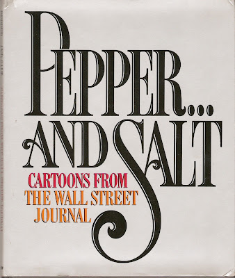
Here are some cartoons by George Dole that appeared in the above book PEPPER ... AND SALT CARTOONS FROM THE WALL STREET JOURNAL, copyright 1984 by Cartoon Features Syndicate.


I know little about George Dole. The only thing I know is his work. All of his cartoons I have seen are gag cartoons. They are all good. The one above, a 24 year old cartoon, still works -- especially in light of this week's Democratic Convention.


I like the sketchiness of his finished drawings. I mean, the top of the boss's desk is three disconnected lines. And it all works.

On a personal note, many years ago I had a regular day job career. I was good at my job and brought money into the place. For six years, like everyone else, I took a vacation for two weeks in the summer. One year, I was told I could not take my vacation from my 9 to 5 job because I was "irreplaceable." I laughed and then I quit.


I like looking at those little lines over the foot to signify sandals. It's very basic and works fine. I like Dole's eyes as well. They are sometimes small, sometimes big -- and always in the moment.


I like Dole's use of language. The quick shapes of the glass and ashtray impress me because they are (a) so sloppy but (b) they still "read" as a glass and ashtray.


"Go on in Harry -- What are you waiting for?"

Several cartoons in the collection have straight borders around them, like the one above. This reveals one of Dole's great stylistic choices: no one stands straight. Even the 2 salesmen stand slightly akimbo.


Above: a true cartoon if ever there was one. Look at those four doodly lines in the background to denote rocks. The unibrow line over eyes of the caveman speaking shows us that he's one tough guy.


Above: I like this one and it would sell today I think. Or is it offensive to Muslims? I don't think so at all.

Cartoonist George Dole whose contemporary, fast sketch style I love. I wish I knew more about you!

Clear Days in the Pittsburgh Symphony Advertising Department


The Pittsburgh Symphony has the above gorgeous, slick, full color ad for its Sunday Ovation Series. The layout and colors and typography all just look lovely. Lots of time and lotsa money was spent on that ad. Lotsa people involved too, I bet. They're a class operation. Hoo boy.

Too bad there is a glaring error in there. I didn't see it for about 30 seconds, but then it hit me. Maybe you don't know your classical music musicians, but if you do, then you'll spot it. And there's a "tell" in the photo too.

I'll tell you the mistake after the spoiler alert header:

SPOILER ALERT

OK, there is a simple error that should have been caught during the initial proofing of this ad. The "tell" is that Joshua Bell is holding a violin. You can see the scroll of his fiddle in his hand. But the copy reads, "Joshua Bell, Piano."

Joshua Bell is one of the biggest names when it comes to classical fiddle, gang!

A big thanks to dear ol' Professor Lynch (AKA Dad) for spotting the glaring mistake and sending this clipping. Even though he had written on a sticky "Clear days in the advertising department!" right next to it, I just could not believe whatta dopey mistake this was.

True Ink: A Mini Graphic Novel by Stephanie Piro


Via The Six Chix blog: here is True Ink: A Mini Graphic Novel About Love, Revenge … and Optimism by Stephanie Piro.

I laughed out loud, Steph! Fun stuff!

WOMEN'S WORLD August 25, 2008

Sometimes I hear people ask why more magazines don't print single panel gag cartoons. Here's a profile of one that uses hundreds a year.


Here's the August 25, 2008 issue of the supermarket mag WOMEN'S WORLD, which is on zillions of racks at the checkouts of many, many grocery stores and supermarkets.

Just looking at its masthead by first name (Stephanie, Nuna, Amanda, Maria, Kathleen, Andrea, Deborah, Kristin, Jamie, Nancy, Taryn. etc.) -- dozens and dozens of names, all female, except for its Creative Director -- we see that it's by women for women.

The table of contents boasts these article titles, all ending in an exclamation point. No kidding! Here are a few of them:

  • Corn-on-the-cob cupcakes!
  • The belly fat cure!
  • Lose 7 lbs a week on Oprah's 21-day detox!
  • Dinner under 99 cents!
  • Which new fall handbag is perfect for you?
  • Miracle Girl - Suzanne's baby needed a hear transplant -- thankfully, she had angels on her side!


WW is also a regular cartoon market. They publish weekly. That's 52 issues a year (no taking a week or two). They pay $150.00 per cartoon upon acceptance and there are in this issue 6 cartoons. If we take that on average, then that comes to $46,800 paid out for 312 cartoons per year. This tells me that someone at Bauer Publications (Stephanie? Nuna?) likes cartoons and feels they're worth having in the mag.
The cartoons appear in the front of the magazine (page 3) and the inside back page.

While I'm glad that they have cartoons, I have some concerns about the editorial choices and layout:

  • The cartoons appear on the amateur pages. Readers may assume that the cartoons are by amateurs as well. Ron Morgan, who drew the "dinnertime minutes" cartoon, is a full-time cartoonist whose work has appeared in magazines for over 30 years. (I pulled the informaiton about Ron from his Blogger page; no Web site found, but if anyone knows of one then I'll hapilly post it here.) Aaron Bacall, whose fat dog cartoon is my favorite, is a prolific cartoonist whose work has appeared in books and magazines for years. The third cartoonist, well, who knows who drew that one? It was either unsigned or cut off by the layout person. I would know who it was if there were credits. Which brings me to:

  • No name credits, like "Cartoons by John Smith." The regular people who send in jokes, stories and their baby photos get credit, why not cartoonists?


  • Harley Schwadron is one of the best cartoonists out there. Why oh why did he get a block of text pasted almost in the middle of his cartoon? A little respect, please.

I was surprised at that last choice, because it is a choice to plaster a gag line directly on top of a visual. And it made me angry that WW chose to do that. The editors should not -- and a light -- even this wee dinky Mike Lynch Cartoons blog light -- should be shined on it.

I mean, do we really want the above?

Above classic seal bark cartoon by James Thurber is copyright by Conde Nast I believe. The WW content is copyright 2008 by Bauer Publications. If the cartoonists crossed out the all rights paragraph in their WW contract, then the cartoons are copyright the respective cartoonists.

And now we'll see if I ever sell to WW again after this criticism. Hmm ....