

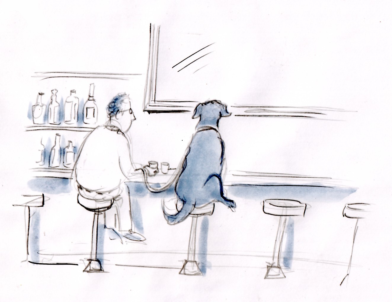
Above: a pencil and wash rough.
Hey! My first book cover! Wow! And the book just came out.
The above images IS NOT the cover. But it was getting close.
Here's the background:
I was contacted last spring by an editor at St. Martin's Press about drawing a cover for Ed Breslin's nonfiction hardcover memoir DRINKING WITH MISS DUTCHIE.
The book's about a guy (Ed) and his beloved black Labrador dog who helps him beat his dependency problem.
Here are a series of drawings, in 2 different styles, showing the process.

A dog helps a guy beat his addiction? Now that sounded like a damn interesting book.
So, yes, if you look, there are 2 different styles. I knew that they wanted something in my smoother, "cartoon finish" style, above.
But I didn't feel the style I was drawing in fit -- I wanted to give them something sketchier, more illustrationy. So I drew the ones below in addition to the others.

As you can see, the pen line just loosely suggests shapes.
The visual was: a guy and his dog in a bar. The editor suggested this. And I agreed.
 Fortunately, the editor liked my loose, illustrative style. The drawing got better when I began to place the dog on the adjoining bar stool. (Above: new, loose style.)
They liked the drawing so much, I was asked if I could do some more drawings for the endpapers. So I drew more Miss Dutchies.
So ... all in all I guess I submitted 6- drawings, with maybe 2 rounds of edits. The job was finished mid-summer 2010.
DRINKING WITH MISS DUTCHIE is out this week from Thomas Dunne Books, a division of St. Martins Press/Macmillan.

Above: the cover, below: the art picked for the cover.

The publisher "flipped" the dog in PhotoShop for the final cover image.


12 comments:
Neat process post. Thanks for sharing. Congrats on the cover!
Ryan Claytor
Elephant Eater Comics
www.ElephantEater.com
AND really nice!! Congrats, Mike!
Despite it's less funny, my favorite drawing is the first one though. LOVE it indeed!
Beautiful, Mike -- I really like it. Like how you showed the process, too.
Nice post on process, and something great to put in your portfolio as well. It's a good drawing--manages to be funny and poignant at the same time. You're a wizard.
I love that loose flowing style, Mike. And that is a great image...the two of them on barstools.
I salute you, sir.
Great work, Mike. That cover turned out fantastic. The rough illustrative style really helps make it work, it makes the dog sitting on the barstool look natural, not cartoony.
Your sketches reminded me of a dog named Bosco who was elected mayor of a town near where I grew up. It was a stray lab that mostly just slept in the bar in town or on the sidewalk out front. Check him out: http://www.roadsideamerica.com/story/19948
Nice work, Mike! Your Miss Dutchie shows a lot of personality in whatever pose she strikes. I like the one picked for the cover especially. Something about dogs & cats sitting down seen in rearview is just funny and, as Brian said, poignant.
The positioning of the leg makes all the difference, which is part of the magic, since it would actually be impossible for the dog to sit on a barstool anyway. However, that touch makes for a credible impossibility!
Really nice drawings, Mike. Nice coloring, too. I love the minimal aspect of it, too.
Congrats on the book and your work Mike.
Hi Mike,
Nice loose drawings . . . love 'em . . .
Roy Delgado
Post a Comment