Above: Denny O’Neil writes and Neal Adams draws from a 1970 issue of DC Comics' Green Lantern/Green Arrow series.
Legendary comic book writer Dennis J. "Denny" O'Neil passed away at home of natural causes on Thursday June 11, 2020. He was 81.
Denny O'Neil will forever be linked to the Green Lantern/Green Arrow series. O'Neil wrote "socially relevant" stories, validating the perception that comics were able to tackle subjects like drug abuse and racism. Some of these comic books, beginning in 1969, were published without the Comics Code approval. They sold anyway.
He got his start at the low-paying Charlton Comics as a freelancer. When then-Charlton Editor Dick Giordano was offered a position at DC Comics, he took several freelancers, including Denny, with him. As writer and editor, O'Neil would go on to write for all of the major superheroes at DC. Later, he moved to Marvel, writing, among other things, Spider-Man.
As an editor, he is principally known for editing the various Batman
titles. He also sat on the board of directors of the charity The Hero Initiative and served on its Disbursement Committee.
DD Degg has many, many great visuals and links here.
DC Comics remembers Denny O'Neil
Marvel: Remembering Denny O'Neil
Tuesday, June 16, 2020
Monday, June 15, 2020
The Garden As of June 15, 2020
Well, here we are with some new raised beds (cedar) and new dirt and new mulch around them.
Had a bit of drama with one of the boxes' sides flopping over due to me not putting things together exactly right, but I put in a couple of L-brackets inside and all seems to be well with holding the soil in.
Garden in progress here:
Tomatoes and peppers.
Zucchini.
TBD.
Some zinnias. More to come.
More anon.
Related:
The Garden As of Early June 2020
Had a bit of drama with one of the boxes' sides flopping over due to me not putting things together exactly right, but I put in a couple of L-brackets inside and all seems to be well with holding the soil in.
Garden in progress here:
Tomatoes and peppers.
Zucchini.
TBD.
Some zinnias. More to come.
More anon.
Related:
The Garden As of Early June 2020
Sunday, June 14, 2020
Murray Olderman 1922 - 2020
Syndicated sports cartoonist and writer Murray Olderman,
whose work appeared in over 750 newspapers, died on June 10th at a
retirement community in Rancho Mirage, CA. He was 98. His work dominated
the now-lost world of sports cartooning, when papers and syndicates
regularly had cartoonists drawing caricatures and commentary on the
sports personalities of the day.
Called a "rare double threat," Mr. Olderman wrote and drew features for over 35 years while syndicated by the Newspaper Enterprise Association. He began with NEA in 1952, becoming its sports editor 12 years later, then executive editor in 1968, and a contributing editor in 1971. Although he announced that he "retired" in 1987, he was still active until NEA was bought out by another corporation.
He was the founder of the Jim Thorpe Trophy, and he also created the NEA All-Pro team, which ran from 1954 to 1992.
He wrote for magazines, such as the Saturday Evening Post, and produced books of his writing and drawings. Most were about football.
A two-time recipient of the National Cartoonists Society Sports Cartoon Award in 1974 and '78, Mr. Olderman also received the Pro Football Writers Association Dick McCann Memorial Award in 1979. He was inducted into the National Sportscasters and Sportswriters Association Hall of Fame in 1993. In 1997 he was inducted to the International Jewish Sports Hall of Fame. He was inducted into the Northwestern University Medill Hall of Achievement for 2014.
Related:
NY Times obituary
The Daily Cartoonist
Called a "rare double threat," Mr. Olderman wrote and drew features for over 35 years while syndicated by the Newspaper Enterprise Association. He began with NEA in 1952, becoming its sports editor 12 years later, then executive editor in 1968, and a contributing editor in 1971. Although he announced that he "retired" in 1987, he was still active until NEA was bought out by another corporation.
He was the founder of the Jim Thorpe Trophy, and he also created the NEA All-Pro team, which ran from 1954 to 1992.
He wrote for magazines, such as the Saturday Evening Post, and produced books of his writing and drawings. Most were about football.
A two-time recipient of the National Cartoonists Society Sports Cartoon Award in 1974 and '78, Mr. Olderman also received the Pro Football Writers Association Dick McCann Memorial Award in 1979. He was inducted into the National Sportscasters and Sportswriters Association Hall of Fame in 1993. In 1997 he was inducted to the International Jewish Sports Hall of Fame. He was inducted into the Northwestern University Medill Hall of Achievement for 2014.
Related:
NY Times obituary
The Daily Cartoonist
Saturday, June 13, 2020
Dan Danglo 1925 - 2020
Long-time Berndt Toast Gang member, best known for his work on Felix the Cat, Dan Danglo passed away in his sleep this past Saturday night. He was 95.
Via Adrian C. Sinnott, BTG chair:
Dan was probably best known for his work on "Felix the Cat.” Dan worked in animation (Popeye, Scooby Doo & Scrappy, too and the Tasmanian Devil), advertising, comics and gag cartooning. As well as teaching classes at Hofstra University and SVA. He was also involved in the production of the animated feature “Tubby the Tuba” which indirectly started the 3D animated movie industry when two principles later formed Pixar. https://en.wikipedia.org/wiki/Tubby_the_Tuba_(1975_film)
From Dan's site:
Dan Danglo was born in Brooklyn with a burning desire to work for Walt Disney and 18 years later found himself working at Terry Toons.
During World War II, Dan served with the 4th Air Force in San Francisco as cartoonist for the headquarters newspaper.
After the war, Dan did comic book penciling, magazine gag cartoons and worked in the Story Department at Famous Studio doing Popeye and Casper the Friendly Ghost storyboards. He also did storyboards and layouts for the feature-length cartoon “Tubby the Tuba” at NY Tech.
In 1956, Dan became Art Director in the Visual Presentation Department at Young and Rubicam Advertising Agency. In 1970, Dan became Vice-President of Visual Presentation and Creative Director of Rollerman Enterprises creating corporate cartoon spokesmen and marketing properties.
Dan has also done storyboards for Warner Bros. and Hanna Barbera (such as Tazmanian Devil and Scooby Doo and Scrappy Too), as well as many projects involving Felix the Cat.
Dan has also taught Animation Storyboarding at Hofstra University and Animation Layout and design at the School of Visual Arts.
Dan really did have a wonderful life. He got to do storyboarding, comics, comic strips, advertising, animation, gag cartoons. And all of the characters he worked on: Popeye, Felix the Cat, the Tasmanian Devil, Scooby Doo, the Mario Brothers; and working for Terrytoons, Warner Brothers, Hanna Barbera. Wow!
From a 2007 email from Dan:
Mike:
This photo was taken in the 1950s, in the Famous studio story dept. I shared an office with Larz Bourne, (the tall gentleman in the sweater... who had started in the business in the early Fleischer days..went on to create Deputy Dawg..and later story editor at Hanna Barbera...The Gentleman in the middle, in the vest, was I. (Izzy) Klein...One of the earliest cartoonist on the New Yorker...Disney animator..and story man in the next office..and the youth with them used to be me....
Pretty illustrious company. Didn’t realize at the time how lucky I was...Still am, being a member of the Berndt Toast Gang.....
Dan Danglo
More here:
Larz Bourne, Izzy Klein & Dan Danglo at the Famous Studio
Related:
The Daily Cartoonist
Friday, June 12, 2020
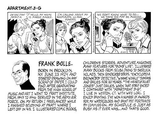
Frank Bolle 1924 - 2020
Prolific comic strip and comic book artist Frank Bolle passed away on May 12, 2020 in Weston, CT. He was 95.
Above: a romance tale written by Nicola Cuti and drawn by Frank Bolle from a 1976 Charlton comic book. The whole story is here.
Like so many cartoonists, he started drawing as a child and just didn't stop. He was a go-to artist whose style was suitable for many stories. He drew the Doc Solar and Tim Holt comic books (in addition to many others), as well as children's books, Boys' Life magazine; he worked on the syndicated comic strips Winnie Winkle, Gil Thorp, Prince Valiant and Apartment 3G, among others. Frank Bolle's career, which spanned the golden age of comics until the 21st century, may be unsurpassed in its breadth and versatility.
From the Leo P. Gallagher and Son Funeral Home Obituary:
"Born in Italy on June 23rd, 1924 and traveled across the ocean alone at 5 years old to join his mother in Brooklyn, NY. He Grew up in NYC with his mother Mary and stepfather Egidio 'Louie' Covacich. Frank graduated Manhattan’s School of Music and Art then studied at Pratt Institute in Brooklyn, only interrupted by a stint in the Army Airforce in 1942."
The Daily Cartoonist:
"Frank’s work was seen at just about all the comic book companies and comic strip syndicates.
I don’t think the internet has enough bandwidth to list all of Frank’s work individually so
here’s Jerry Bails’ Who’s Who breakdown
and the Lambiek Comiclopedia biography."
I met Frank a number of times in Connecticut for their monthly cartoonists' lunch in Westport. This was in 2006 and '07, and the group was composed of a number of cartoonists and friends including comic book artist Frank McLaughlin and great gag cartoonist Orlando Busino. Frank was just one of the nicest fellows and I noticed he listened more than he talked. One day my phone rang and it was Frank. He wanted to talk to me about markets and the internet. I think we chatted for about 20-30 minutes. He was curious about how a cartoonist used the web. I was amazed that he called me, and he was very polite and gracious, but also very serious about this. I don't think there was a day in his life where he didn't work. That's the thing when you do what you love!
Frank McLaughlin, Orlando Busino, and Frank Bolle in 2007.
Thursday, June 11, 2020
Penciling and Inking Cartoons
"How do you learn to draw?"
The old story goes that you get a big stack of paper, as tall as you are, and take a sheet of paper off the top, and draw on it. Then you take another piece of paper and draw. And so on, drawing on every page. By the time you've gotten to the very bottom of that tall stack, you've improved!
So, you get the bad drawings out of your system. After a while, you can look at a blank piece of paper and see how you want your picture to be composed.
Speaking for myself and my drawings, I always liked my pencils and hated my inks. I decided that I "freezed up" when inking. I was tracing my relaxed, sketchy pencil line with a static, mechanical, boring line. The ink line made, I believed, everything look dead. It wasn't fun to look at.
I had been drawing with a pencil since I was a kid. Using a fancy schmancy ink pen (a bowl tip Hunt dip pen nib or a Pigma Micron pen or whatever) caused me to hesitate and worry: the ink is PERMANENT and IMPORTANT -- BE CAREFUL! And so I was careful, and my inks were there, but they weren't fun to look at.
"The Macaroni Trio" cartoon, an early-in-my-career Mike Lynch Cartoon from BBC Music Magazine
above, shows my heavy inking line. The instruments are too close
together with this layout -- not apparent to me when penciling. They
don't stand out individually with the addition of the heavy inks paid on
top of the spritely pencils. You have to really look for a few seconds
to see the fiddle and the bass and the piano. An extra few second or two to
decode a gag cartoon is not good!
I realized I had to keep cartooning, and couldn't just stop in my tracks and try inking a big stack of pencilled cartoons until I got better. No time to draw stuff just for myself. I had to solve this quickly, and still produce salable work.
I was talking to R.J. Matson who, at the time, was head of the NYC National Cartoonists Society Chapter. If I remember correctly, he said he inked entirely with fancy Waterman pens -- the ones that go for a lot of money. But, he said, he loves the looks of his pencils better. They're more free, more full of the energy of drawing.
Well, there it was. That's what I wanted! A lively line line that looked like it was drawn, not traced! I wanted my cartoons to look fresh, like they were out of a sketchbook.
Sure, I can draw in pencil and scan the pencils in to Photoshop, ratchet up the contrast and -- boom -- it looks like an ink line. But my originals would look pretty pale. I had all ready realized that there's money to be had in selling originals. And potential buyers want what they saw in the published version. Pencils would not look right.
I draw on heavy 24 lb. typing paper. It's not very expensive. And it doesn't bother me to throw away a drawing that isn't going well.
If I stop penciling, and just ink directly, maybe then I could get the line I wanted. And I could then eliminate the penciling altogether. Sure, I may have to toss a lot of the drawings, but I draw pretty fast. And, there would be no erasing. With no penciling and no erasing, this new method could, if I was able to master it, be a time saver.
So, I started to draw on a white piece of paper with no penciling, deciding that if the drawing turned out OK, it was a keeper. And if the drawing didn't work, I would toss it. I drew as fast as I could, but taking a bit of time to picture the composition in my mind.
Above: a rather doodly cartoon for Reader's Digest. The line was not labored
or dead. I don't know if you can see what I mean, but I can.
I started just drawing whatever I could think of. Here's one from the early days of TVs in cars. Again, no pencils; just a micron pen and some wash. I drew the fellow in the car first, and then worked outward. Note how I am just suggesting the other cars and smog with minimal lines. Sketchy and loose was what I was going for here.

Now I have done many, many finished drawings with no pencil foundation. Again, I think I'm fortunate that I can look at a piece of paper and see what I want where. It becomes easier to manage layout the more you draw.

So, that's my little production secret: no penciling. I like the line I get when the drawing tool is actually drawing, y'know? And, after doing a lot of drawings like this (maybe not as many as would be in a six foot high stack), I'm able to draw faster and I'm not afraid of the ink pen! I don't think it's for everyone, but drawing without pencils really freed me up, gave my cartoons a better look, and made me happier.
And, yes, I do recycle all those crumpled up drawings at the local recycling facility!
-- Edited quite a lot from an April 18, 2008blog entry.
The old story goes that you get a big stack of paper, as tall as you are, and take a sheet of paper off the top, and draw on it. Then you take another piece of paper and draw. And so on, drawing on every page. By the time you've gotten to the very bottom of that tall stack, you've improved!
So, you get the bad drawings out of your system. After a while, you can look at a blank piece of paper and see how you want your picture to be composed.
Speaking for myself and my drawings, I always liked my pencils and hated my inks. I decided that I "freezed up" when inking. I was tracing my relaxed, sketchy pencil line with a static, mechanical, boring line. The ink line made, I believed, everything look dead. It wasn't fun to look at.
I had been drawing with a pencil since I was a kid. Using a fancy schmancy ink pen (a bowl tip Hunt dip pen nib or a Pigma Micron pen or whatever) caused me to hesitate and worry: the ink is PERMANENT and IMPORTANT -- BE CAREFUL! And so I was careful, and my inks were there, but they weren't fun to look at.
I realized I had to keep cartooning, and couldn't just stop in my tracks and try inking a big stack of pencilled cartoons until I got better. No time to draw stuff just for myself. I had to solve this quickly, and still produce salable work.
I was talking to R.J. Matson who, at the time, was head of the NYC National Cartoonists Society Chapter. If I remember correctly, he said he inked entirely with fancy Waterman pens -- the ones that go for a lot of money. But, he said, he loves the looks of his pencils better. They're more free, more full of the energy of drawing.
Well, there it was. That's what I wanted! A lively line line that looked like it was drawn, not traced! I wanted my cartoons to look fresh, like they were out of a sketchbook.
Sure, I can draw in pencil and scan the pencils in to Photoshop, ratchet up the contrast and -- boom -- it looks like an ink line. But my originals would look pretty pale. I had all ready realized that there's money to be had in selling originals. And potential buyers want what they saw in the published version. Pencils would not look right.
I draw on heavy 24 lb. typing paper. It's not very expensive. And it doesn't bother me to throw away a drawing that isn't going well.
If I stop penciling, and just ink directly, maybe then I could get the line I wanted. And I could then eliminate the penciling altogether. Sure, I may have to toss a lot of the drawings, but I draw pretty fast. And, there would be no erasing. With no penciling and no erasing, this new method could, if I was able to master it, be a time saver.
So, I started to draw on a white piece of paper with no penciling, deciding that if the drawing turned out OK, it was a keeper. And if the drawing didn't work, I would toss it. I drew as fast as I could, but taking a bit of time to picture the composition in my mind.
"Ahh. The arbitration team is here."
I started just drawing whatever I could think of. Here's one from the early days of TVs in cars. Again, no pencils; just a micron pen and some wash. I drew the fellow in the car first, and then worked outward. Note how I am just suggesting the other cars and smog with minimal lines. Sketchy and loose was what I was going for here.
Now I have done many, many finished drawings with no pencil foundation. Again, I think I'm fortunate that I can look at a piece of paper and see what I want where. It becomes easier to manage layout the more you draw.
So, that's my little production secret: no penciling. I like the line I get when the drawing tool is actually drawing, y'know? And, after doing a lot of drawings like this (maybe not as many as would be in a six foot high stack), I'm able to draw faster and I'm not afraid of the ink pen! I don't think it's for everyone, but drawing without pencils really freed me up, gave my cartoons a better look, and made me happier.
And, yes, I do recycle all those crumpled up drawings at the local recycling facility!
-- Edited quite a lot from an April 18, 2008blog entry.
Wednesday, June 10, 2020
Best Cartoons of the Year 1964 Part 2
Above:
the dust jacket to BEST CARTOONS OF THE YEAR 1964. I thought that I did
not have the dust jacket, but it turns out I have 2 copies of this
hardcover gag cartoon collection -- one with the cover, one without.Part one is here. The book is copyright 1964 by the series' long time editor Lawrence Lariar.

I don't know why Ton Smits isn't better known in the States. He was, after all, a New Yorker cartoonist. He even has a museum in his native Netherlands. Smits draws in that minimalist UPA kinda cartoon style, and he's a great comic writer.

Reamer Keller is one of my favorites. I like his loosey goosey line -- but this one looks so loose that it looks like a rough. Regardless, Parade published it and he chose it as an example of one of his best of the year. The BEST CARTOONS books purported to allow the cartoonists themselves to pick their own cartoons for publication.
I
love Don Orehek's work. He's a master cartoonist. Above is an early
one. Look at how happy the hubby is, counting the money. Nice touch: the
heart on the hurdy gurdy.
With postage in the states at 55 cents per letter, this represents a considerable sum of money. Jack Markow wrote a number of how to cartoon books.
Gallagher is right on the money. I've seen this with strollers -- so full of merchandise that the kid has to hoof it instead of riding in his usual style!
Tom Smits once again. All you need to see is her eyes to get the gag.
Al Kaufman gives a great line to the nurse. Look at her feet: one coming up for a step, the other posed down. A good touch for showing a bit of motion. The disheveled pear shaped fellow with the tousled hair wordlessly expresses his surprise.

The goofy goings on of bank robbers as portrayed by Bob Weber. I never knew that the Master Detective magazine had cartoons!

Nowadays, one of those names does not belong. But as of 1964, as we all know, Nixon (pre-presidency, pre-Watergate) had narrowly lost to JFK. I like that flutey, loopy feather in the hat.
Phallic symbols arise in Joe Farris' space age cartoon. Lovely brush work, eh?
Orlando
Busino's cartoon reminds me of the almost weekly uproar about cartoons
that continues on and on. Folks, they're just
pictures!Easy end-of-page link to part one here.
-- This has been an edited version of a June 3, 2008 blog entry.
Tuesday, June 09, 2020
Best Cartoons of the Year 1964 Part One

Here's some cartoons from the BEST CARTOONS OF 1964, "being a selection, by the artists themselves, of the best cartoons they drew for the leading magazines in the country for the past year." It's copyright 1964 by the series' long time editor Lawrence Lariar. The nice dustjacket cover has long since been landfill, so here's the frontispiece.

Bob Weber's cartoons are always fun. Full of lowlifes, full of action -- and there's always an old timey bigfoot style cartoon touch to admire. In this case, I'm admiring the little puffs of smoke behind the hubby. This guy gets snaps for escaping the police and running through town without losing his stogie! #priorities

Here's a nice pen scratchy Joe Farris cartoon. It's only by letting my eye wander for a moment, focusing in on what the shrink is looking at, that I was able to see those patient's fingers.

George Dole is one of the greats. I like his wide-eyed characters and easy, quick sketch style.
I like how the kid's hand is at his hip. So theatrical. Bo Brown has made a good point.
Jack Tippit with a prescient cartoon. Lariar wrote in his introduction that, "The past year may well go down in history as The Year of the Unleashed Libido." Uh oh. This cartoon certainly qualifies.
Arthur Henrickson with an early raw food market cartoon.

The one and only Don Orehek with a dopey cop. Note how his black spotting gets your eye bouncing between the 4 "Budapest String Quartet members" and the foreground. Don is a master at layout.

Vahan Shirvanian gives us a 2 panel take on an old idea. I laughed at it. Maybe you saw it coming, but I didn't!

Do kids even know what a divining rod is? Here's another multi-panel by Jack Tippit. You can never have enough Tippit.

Michaud made me laugh out loud. Another "Year of the Libido" cartoon, for those who are counting! Look at the lovely little details of the room, and that easy, sweeping wash.

Jim Whiting reporting on the wild, drunken parties. Nowadays, a quick phone call from one of the kids' cell phones to Child Protective Services would bring about a swift end to this behavior!
This
is maybe a dated and silly gag, but look at the composition: a sea of
frowns as we look from left to right -- and then we see the exception,
and read the gag line. All done in an economic 2-3 seconds.-- Edited from an original blog entry of May 30, 2008.
Subscribe to:
Posts (Atom)